
More than a shade of 2000 for NVDA, AMD, INTC...
Investment News

What the oil surge means for electrics and inflation...

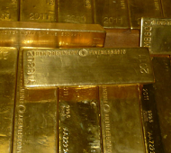
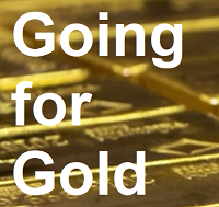
But just you wait...

Natural gas is vital to nitrogen fertilizer...
Follow Us
Mobile apps
- live trading 24/7
- buy & sell instantly
- up-to-the-second charts


⬤ ⬤ ⬤ ⬤ ⬤ ⬤
 Email us