
...via a falling currency value...
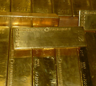
Gold in History

Defense investment surges on AI...

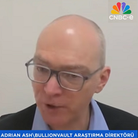
Just keep buying and holding instead...

Prices never going back down...
Follow Us
Mobile apps
- live trading 24/7
- buy & sell instantly
- up-to-the-second charts


⬤ ⬤ ⬤ ⬤ ⬤ ⬤
 Email us