Trading the GDX/Gold Ratio
New uptrend seen for gold miners...
The GOLD MINING SECTOR has been dead money for two years, writes Jeff Clark, editor of the Delta Report, in Bill Bonner's Diary of a Rogue Economist.
The VanEck Vectors Gold Miners ETF (GDX) traded for $21 per share at the start of 2017. Now, nearly halfway through 2019, GDX is still trading for $21 per share.
So, like I said...dead money – at least, for the typical "buy-and-hold" investor.
But traders have had plenty of chances to profit.
Yes, GDX is still trading at the same price it was at more than two years ago. But during that time, GDX has rallied as high as $25 per share and dropped as low as $18. So, there was a giant, $7 trading range in which traders could profit – if they knew how to spot the turning points.
And the best way to spot the turning points in the gold sector is by following the GDX/Gold ratio.
We get this ratio by simply dividing the price of GDX by the price of gold. This ratio tells us how strong or weak gold mining stocks are relative to the metal.
You see, the action in gold stocks leads the action in gold. If the GDX/Gold ratio is moving higher, it means gold stocks are stronger than the metal. That's usually a good sign for the sector and for the price of gold.
If the ratio is moving lower, then gold stocks are weaker than the metal. That's usually bearish.
If you own gold mining stocks, then you want the GDX/Gold ratio to be moving higher. That's when you get the strongest, most bullish action in the gold sector.
But if you don't own gold stocks yet, and you're looking to get in, then you want to look for signs that the GDX/Gold ratio is bottoming, and then buy into the sector just as the ratio turns higher.
To get an idea of what I'm talking about, take a look at this one-year chart of the GDX/Gold ratio...
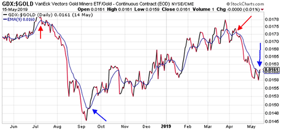
Over the past year, this ratio has traded between 0.0145 on the downside and 0.018 on the upside.
The squiggly blue line on the chart is the 9-day exponential moving average (EMA) line – a weighted average of the ratio over the past nine days.
All you need to know about this line is that it indicates the short-term trend of the gold sector. If the ratio is trading above the squiggly blue line, then the short-term trend is bullish. If the ratio is below the 9-day EMA, then the immediate trend is bearish. It really is that simple.
Now, if you're looking to buy into the gold mining sector, an easy strategy is to wait until the ratio is near the lower end of its trading range and then pops above its 9-day EMA. If you own gold stocks and are wondering when's the best time to take profits, well...that's when the ratio is near the upper end of its trading range and then drops below the 9-day EMA.
The blue arrows on the chart above show the optimum times, in my opinion, to buy into the gold sector. The red arrows point to the best time to sell.
Here's how GDX performed after each trading signal...
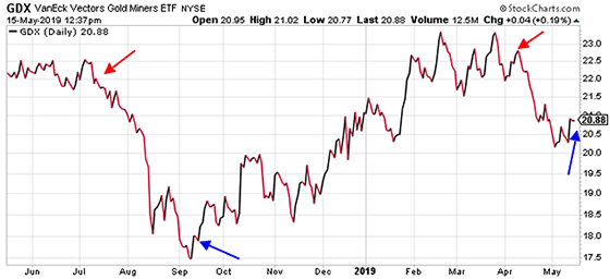
By following the signals from the GDX/Gold ratio chart, traders would have sold – or even shorted – gold stocks last July when GDX was above $22 per share. Then, they would have bought into the gold sector in September when GDX was trading near $18.
The uptrend in the gold sector persisted for several months, until April – when the GDX/Gold ratio chart clearly broke down. Traders could have exited positions when GDX was trading near $23.
The gold sector has been moving lower for the past several weeks. But it hasn't been a dramatic decline. GDX is down only about 8% or so from its April high.
Recently, though, the GDX/Gold ratio chart has popped above its 9-day EMA. I think it's signaling the start of a new uptrend for the gold sector.
And I expect GDX will be higher several weeks from now.


 Email us